

When investors talk about beating the market, they usually mean picking stocks.
That’s one way to do it, but an arguably safer, more consistent way to do it is to use historic market trends to weight your portfolio towards the asset classes currently in the dips of their long-term value cycles.
All the asset types move in cycles relative to each other on a grand historic scale. Gold for example will spend decades valued highly relative to stocks, only for the pendulum to swing back the other way and become comparatively cheap.
By analysing how asset values have moved against each other over decades, we can see patterns that repeat themselves, and choose to allocate our portfolios more towards assets that are currently cheap.
This is about stacking the deck in your favour. It’s the long-term approach to beating the market. But which assets should you allocate more towards?
Don’t forget to check out the Offers page to scoop up some goodies we’ve collected for you. These include links to Freetrade and Stake accounts, who are giving away free stocks!
Relative Asset Values
Working out if it’s a good time to buy into a type of asset is possible by comparing 2 assets directly to each other.
It’s no good looking at their cash values, as almost every asset type has gone up massively in cash terms over history – so not very helpful for analysis.
That’s because cash is constantly losing value to inflation, exaggerated by government money-printing programs.
But between the other asset classes, the differences in their values change slowly over time as they fall in and out of fashion, and as a result of a gradually changing world.
120 ounces of gold will buy you an average UK house in 2020, but in 2004 you’d need 350 ounces of gold.
There’ll be times when a house could be sold to buy 2,000 shares of X company, and other times that this same property could be traded in for 3,000 shares of the same company – cash values don’t come into it at all.
In this article we’ll be comparing assets against each other to work out which stand to do the best over the next couple of decades – starting with…
Gold vs Stocks
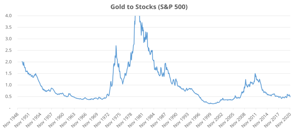
The story of gold is fascinating. Going back 70 years, we see reasonably smooth, cyclical trends going up and down.
Fig.1 is showing a trendline for the value of gold divided by the value of stocks, for which we have used the S&P500 as a proxy for all stock markets.
In 1950 1 Troy Ounce of gold was worth 2 times the S&P500, in 1982 1 ounce of gold was worth 3 times the S&P500, in 2011 1.5 times, and so on.
A reasonable man or woman in the street may have assumed the ratio between gold and stocks would be either a flat line, or a random zig-zag, but what we actually see is a cyclical trend – the ratio moving in decades-long curves.
Gold is currently at a low valuation relative to stocks.
But it’s important to understand the context of what was happening at the time in the world during each dip and spike before we pile our money into gold.
The 50s and 60s saw a recovery after the Second World War with stocks outperforming safe haven assets like gold as economies picked themselves up again.
Then in 1971, President Nixon took the dollar off the gold standard, which had previously fixed the price of gold at $35 an ounce, which explains this sharp spike as gold was let loose to find its own value.
The trend continued upwards during the early 80s, leaving this chart entirely and hitting brief highs of 6.4x in 1980 when high oil prices – another asset – caused high inflation across the world.
Then stocks took over again – the period from the 80s to the millennium was one of strong economic growth.
As you might have guessed, the story of stocks and gold are tied to economic cycles – when we’re in a good period, stocks do well, and when the economic cycle hits a roadblock it’s gold’s turn to shine.
The economy went south again in the years of the last recession, and then stocks recovered for a few years to bring us to today.
Interestingly, the economic brutality caused by the coronavirus hasn’t really appeared on this chart – the data goes up to November 2020, but we can see that the relative value of gold held steady.
We think that what we’re seeing in the chart is another bottom in 2020. The only time gold was valued lower in the last 70 years was during the foolish sell-off of gold by central banks – a policy swiftly halted once they realised that they’d ballsed up big time.
Incidentally, between 1999 and 2002, UK Chancellor Gordon Brown sold 56% of the UK’s gold reserves – at a rock bottom price of $275 an ounce. Gold is now worth $1,800 an ounce.
What a clown. A simple glance at a chart like this would have told him that this was a historically stupid idea.
We think we’re at a point in the gold cycle that if we overweighted our portfolios toward gold, we’d see market beating returns, such as by buying more of the iShares Physical Gold ETC (SGLN).
We’re probably entering one of those periods of the economic cycle where everything goes to hell, starting with the lockdowns of 2020 and the economic chaos that followed.
Gold vs Oil
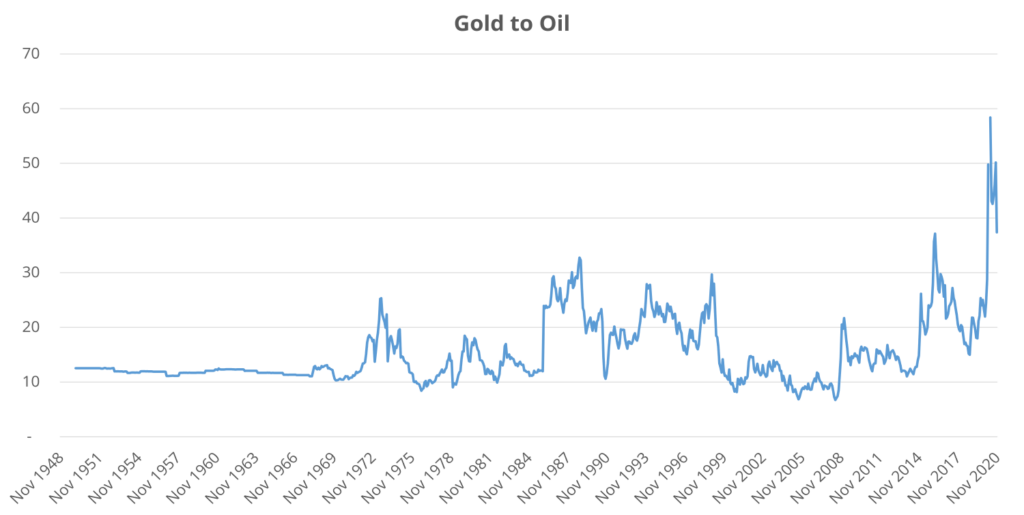
OK, so gold is valued at historic lows relative to stocks. What about oil?
Fig.2 shows the gold price divided by the oil price going back 70 years; the price of a Troy Ounce vs a barrel of Brent Crude. It flat-lined in the years before 1971 because of the gold standard and oil being linked to the US dollar and therefore to gold.
Since the brakes were removed from gold in 1971, we see less of a cyclical pattern, and more of a moving range between 10x and 30x.
If gold was at 30x a barrel of oil, it’d be fair to say that either gold is expensive, or oil is cheap. But look at what’s happening right now at the end of 2020 – the ratio is over 40 times. Either gold is super expensive, or oil is super cheap.
Or maybe the world is moving away from a need for oil. There is widespread belief that renewable energy will make oil redundant.
However, we see this as a slow evolution over many decades still to come.
Gold is not expensive relative to stocks as we’ve proved, so maybe oil is driving this movement.
And we know that the oil price has been massively hit by lockdowns, and will likely rise once economies open up again.
Will oil return to its normal range against gold? History tells us it will, and we should all now be buying oil according to this data, and lots of it.
Here’s an article detailing how we’d go about buying oil.
Is UK Property Expensive?
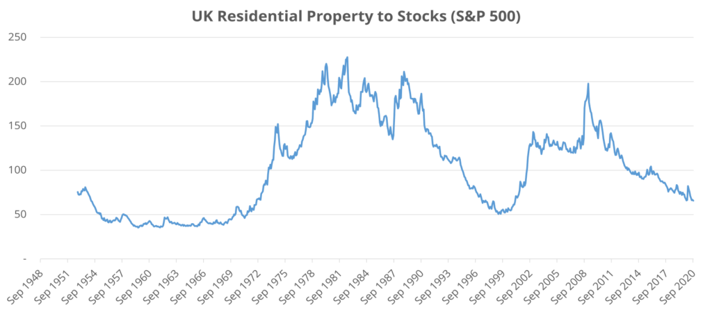
Relative to stocks, it’s a super cheap time to buy residential properties. It’s mostly stocks driving this movement though.
The peaks coincide with economic downturns – the inflation of the 70s and 80s and stocks market crashes of 2000 and 2009 – and the dips with periods of stock market growth.
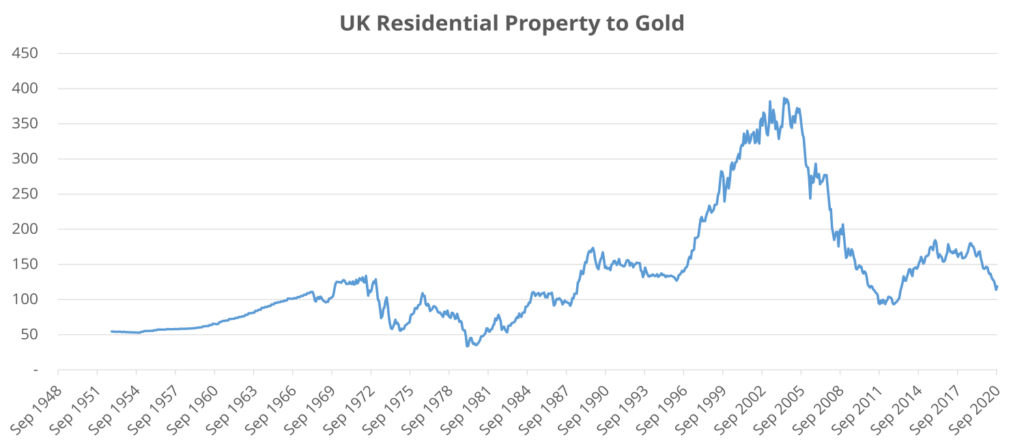
We see a similar story though when we compare UK houses to gold. The average UK property is not far away from being worth just 100 ounces of gold.
The periods since 1971 where property was cheaper than this didn’t last long – and pre 1971 was a unnatural time for gold. Nixon really did change everything when he unhooked gold from the dollar.
But it feels like property is expensive, and getting more so. This is because cash is becoming more worthless.
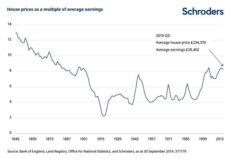
Fig. 5 shows how house prices since around 1900 have been rising as a multiple of earnings.
What we conclude from this section is that property is cheap, but your wage is not able to keep up!
Small Caps Or Large Caps?
Back to stocks – what analysis can be done to beat the market over the long term? Well, one way is to look at the cyclical pattern of small caps vs large caps.
Small cap stocks are not actually small – Investopedia defines them as companies with values between $300m and $2bn.
But they are much smaller than the companies that make up the S&P 500 for instance, which range from $4.5bn to $2,000bn (or $2trn).
And small caps go through long cycles of over and under performance relative to large caps.
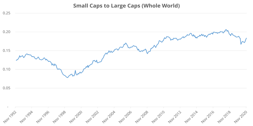
Fig.6 shows a comparison over the last 30 years, with small caps dipping and then going up fairly consistently relative to large caps.
There’s a dip in 2020 which could be the start of a down-trend, but overall small caps are still relatively expensive in 2020.
Whole-world data was limited for small caps, but we found the following chart (Fig.7) which looks at the top 3000 US companies – comparing the bottom 2000 to the 1000 largest.
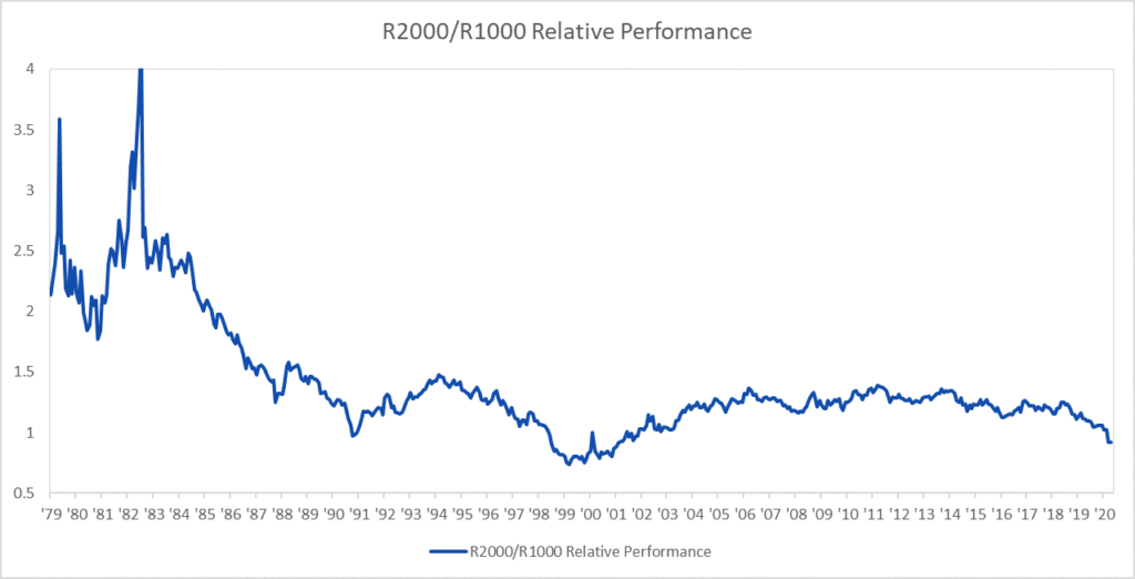
The trend from 1990 to 2020 from Fig.6 is visible in Fig.7 too, but prior to 1990 we can see that small caps were doing much, much better – some would cite this as a reason to buy small caps now.
We’re taking a balanced approach with small caps. To us, they look mid cycle.
Going back to the recent history in Fig.6, a lot has changed since 1990 in the stock market that represents a permanent shift, starting with the invention of the internet.
Although they look expensive now compared to the rest of the modern era, a small cap stock can launch on the internet and take over the world in less than 10 years.
Amazon, Facebook and Google didn’t exist in 1990, and are now all among the top 10 biggest companies in the world.
And small caps have shown historically that they can outperform current levels.
What We’re Doing
We’ll hold our small caps position at 18% of our equities – still a large weighting, without going mad.
We’re giving more of a focus to gold and silver in our portfolios. Silver moves in line with gold but with more volatility.
Where before they took up 5-7%, gold and silver now make up 10% and we are thinking about increasing this further – but it’s a difficult decision to commit so much portfolio space to an unproductive asset.
We said back at the start of the first lockdown that the time was right to buy oil, and we think it still is.
We’ll be holding on to our oil stocks and ETFs in the short term until there’s a recovery in the oil price.
The price may be slightly higher now than what it was during the 2020 crash, but compared to long term trends it’s still ridiculously low.
You still need to hold a majority of diversified stock market funds or ETFs regardless of these trends – there’ll always be an exception to the rule.
Owning the world will always be the best starting point, but you can overweight at the edges towards historically cheap assets.
You could take this further and compare other assets yourself, or run a comparison of stock market industries to see if there’s any historical trends worth knowing about. Let us know what you find!
How will you be tweaking your portfolio as a result of these findings? Let us know in the comments below.
Also check out the MoneyUnshackled YouTube channel, with new videos released every Monday, Thursday and Saturday: